|
If you want to see change happen in your life, you've got to get a vision that goes beyond what you have already seen and experienced.
- Clifton Posey
|
BS Detecting
Are you tired of seeing and hearing bullshit? Me, too! And so are a lot of other people. We can do something about it. We can fight back. We can call-out bullshit, and we can help our friends and families spot it and call it out, too.
“THINK MORE, SHARE LESS”
– Jevin West, coauthor, with Carl T. Bergstrom, of Calling Bullshit, a book and a free online course!
Bullshit: very easy to create, very hard to clean up.
Neil Postman, in his 1969 speech “Bullshit and the Art of Crap Detection” (included below), states his Third Law as:
“At any given time, the chief source of bullshit with which you have to contend is yourself.”
It’s crucial that we constantly evaluate the information we choose to believe and share.
Neil Postman and Carl Sagan helped us tune-up our crap detectors 50 years ago:
Bullshit and the Art of Crap Detection – Neil Postman 1969
Carl Sagan’s Baloney Detection Kit , which is the first chapter of his 1997 book The Demon Haunted World.
 Calling Bullshit
Book available through all booksellers.
Course syllabus: https://www.callingbullshit.org/syllabus.html
Lecture videos: https://www.callingbullshit.org/videos.html
Seeing through the illusions of a fabricated world:
Professors – and professional BS-spotters – Jevin West and Carl T. Bergstrom have created a college course (which we can access for free!) and written a book to help us all spot bullshit, call bullshit, and avoid becoming the victim of bullshit. Below is their presentation of a set of instructional essays on various aspects of bullshit detection and refutation. Many of the examples they draw upon are classic examples that others have brought to light in their articles, essays, blogs, and other sources.
Tools and Tricks:
-
Visualization: Spotting misleading axes.
Data graphics tell stories. Fairly subtle choices on the part of their creators can influence the stories they tell, sometimes in misleading fashion. We look at how the ranges shown on axes can be misleading, and explore the classic issue of when the y-axis of a graph needs to include zero.
-
How do you know a paper is legit?
Any scientific paper can be wrong, but you greatly decrease the chances of being misled if you know how to distinguish legitimate articles from untrustworthy ones. We discuss how to draw this distinction, and along the way provide a brief overview of how the scientific publication process works.
-
Visualization: Proportional ink.
Many data graphics, including bar charts and pie charts, use the sizes of shaded areas to represent data values. We describe what we call the principle of proportional ink: in such charts, the amount of ink used to represent a value should be directly proportional the value itself. Unfortunately, this principle is commonly violated. We explore a number of examples.
-
Which face is real?
Recent developments in artificial intelligence have made it possible to rapidly generate photorealistic images of people who don’t even exist. While these are indistinguishable from real faces at a glance, you can learn to tell the difference with just a bit of practice.
Debunking Handbook 2020
https://www.climatechangecommunication.org/debunking-handbook-2020/
 A free publication describing the current state of the science of misinformation and its debunking. Available in 12 languages on the website. You can read the English version above, and the Spanish version to the left.
Click on either image to read the booklets!
.
Bullshit Detecting: The News
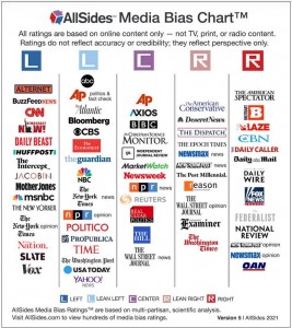
 All Sides
They certainly don’t tell all sides but they present many sides!
https://www.allsides.com/unbiased-balanced-news
https://www.allsides.com/media-bias/media-bias-ratings
Home of the TRUTH-O-METER
Politifact is a fact-checking website that rates the accuracy of claims in the news.They do this to 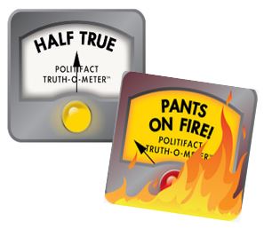 give citizens the information they need to govern themselves in a democracy.
Click here to check out their diverse issues!


